

Empowering 170+ Websites_____
Bp’s purpose is to reimagine energy for people and the planet; helping the world reach net zero and improving people’s lives. Bp partnered with AKQA to reimagine their corporate website; to reinvent their digital identity and become category leaders.
We developed a single, robust design system, with flexible themes, capable of powering 170+ websites across 3 global brands; bp, Castrol and Aral. The modern, accessible, simplistic design and streamlined technical architecture empowered site owners across the globe to author a new cutting-edge experience; delivering consistency across the entire digital ecosystem.
As group creative director, my role spanned from concept to delivery; leading the multidisciplinary team that impressively propelled bp.com to ‘#1 Corporate Website’ in Bowen & Cragg’s Global Index of Online Excellence and ‘Leading corporate website of all FTSE 100 companies’ by Connect IQ.
Agency_____
AKQA
Awards_____
Bowen & Craggs
Connect IQ
Services_____
Brand Guidelines
Creative Concept
Creative Consultancy
Creative Direction
Creative Leadership
Digital Design
Design Production
Design System
Film Direction
Film Production
Prototyping
Social Media
Storyboarding
User Interface Design
User Experience
Visual Identity
Website Design
Wireframing


Typography and palette_____
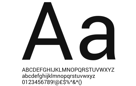
The sans-serif typeface Roboto designed by Christian Robertson and released by Google in 2011 is largely geometric with friendly open curves; perfect for displaying structured, long-form information and data visualisation.
Reserved for headlines and key phrases, 'Better Times for bp' is a hand-drawn font which feels playful and friendly - bringing a more human and empathetic quality to their communications.
The palette is largely made up of bp’s Helios colours - bp green, by light green, bp yellow and white. Greys are used for typography and user-interface.


#000000

#666666

#007F00

#99CC00

#FFE600

#FFFFFF

A design system that powers three global brands_____


Demystifying bp’s Future In Energy_____
As bp decarbonise and diversify their business, reduce oil and gas production and invest in renewable energy, it’s imperative they clearly communicate their ambition, effort and progress to the world - as many remain sceptical and confused. 'The bp Transformation Hub', which we proactively proposed, tells bp’s story of transformation in an accessible, consistent and compelling way; distilling complexity and demystifying bp’s purpose.
Content is streamlined and presented as visually rich, bite-sized chunks; with depth and detail available through progressive disclosure. Language is honest, jargon-free and consumer-friendly - and micro-interactions engage, surprise and delight. Through live updates the hub tracks progress in realtime and shares everything you need to know about bp’s transformation in one simple, localised destination.
As group creative director, my role spanned from concept to delivery; managing the multidisciplinary team that transformed the narrative.
Agency_____
AKQA
Services_____
Brand Guidelines
Campaign
Creative Concept
Creative Consultancy
Creative Direction
Creative Leadership
Digital Design
Design Production
Design System
Prototyping
User Interface Design
User Experience
Visual Identity
Website Design
Wireframing


